Interested in Safety?
Get Safety articles, news and videos right in your inbox! Sign up now.
Safety + Get AlertsAre you looking for a way to get a message to the public about your utility? Or about the services you provide?
Don’t forget the old saying — “a picture is worth a thousand words.”
Infographics can combine the best of both a bright, visual medium and the words it takes to convey a complex message. They’re adaptable to the digital age of the World Wide Web, but they’re still relevant in the traditional ink-and-paper format as brochures, posters and flyers.
In some ways, they’re the oldest medium there is. You can think of those ancient pictures found on the walls of that cave in France as an infographic reporting on the community’s successful hunt.
Raising awareness
When Louisville Water Co. in Kentucky wanted to raise public awareness of the utility’s water quality, infographics were part of the package, says Kelley Dearing-Smith, Louisville Water’s strategic communications manager.

“We’re known for great-tasting drinking water,” Dearing-Smith says. “We ‘brand’ drinking water in Louisville as Louisville pure tap to promote the quality, innovation and value of something most of us take for granted.” The water company has even registered “pure tap” as a trademark. The campaign “promotes hydration, the value of tap water, and is really the public relations vehicle for Louisville Water.”
The audiences can be just as varied, ranging from consumers and business customers to employees or the organization’s governing board. Infographics can communicate all kinds of information.
Jack Rubinger, public relations at Graphic Products Inc., in Beaverton, Ore., says the medium is especially useful for helping convey concrete information in a quick and striking way. “Infographics create a context for statistics, show value for infrastructure investments, dramatize water and energy consumption, and show construction sites with maps,” he says.
In short, then, almost any organization that wants to explain itself may have a reason to employ infographics.
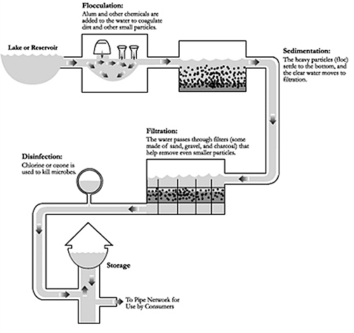
They don’t have to be complicated, either. The Macon (Ga.) Water Authority’s website includes a page on how water treatment works. A simple graphic flow chart tells the story step by step. The page also includes a longer, written description. But for a lot of busy visitors, the graphic treatment is likely to convey the information a lot faster.
Macon’s graphic could easily be printed out as a brochure or flyer. Although it’s on the Web, nothing about it requires it to be in a digital medium.
The water utility in Aurora, Colo., stresses careful conservation of water in the region. One way it does that is by promoting “xeriscape” – the use of water-stingy plantings in private yards and public spaces. A simple flyer with photos of various such plantings on the website quickly conveys the range of options available to anyone seeking to follow the utility’s recommendations.

A step up from a one-page PDF like that is the PDF created from a PowerPoint presentation. Aurora had just such a PowerPoint file that is part of a presentation to explain xeriscape to the public. Converting it to a PDF and posting that made it accessible to a much wider audience than those would have turned out to see the PowerPoint when it was offered at various public meetings and gatherings.
Aurora’s infographic examples represent an economical versatility other utilities can emulate.
But for an organization taking full advantage of the Web’s capabilities, online technology can enable some particularly impressive features.
ShaleNET is a Pennsylvania-based program to recruit and train potential workers for the expanding natural gas extraction industry. The industry has been growing as new methods that have been spurred by the developing of shale gas reserves in regions across the country.
To help communicate the scope of the industry it serves, ShaleNET’s website has an interactive map of the nation that harbors a lot of information in a simple, clean format.
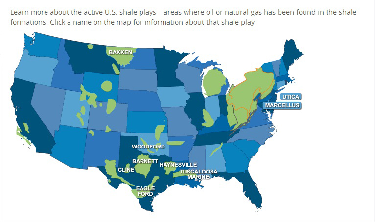
The stylized map shows shale regions around the country. Website visitors can click on a label for a particular region, and up pops a short list of fast facts about that particular area.
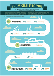
An infographic titled “From Shale to You” explains the processes and businesses involved in the oil and gas industry.
Still another approach, also employed by ShaleNET, is to combine static informational graphics with video. A series of links on the ShaleNET website gives potential jobseekers in the industry a quick set of bullet points about specific jobs and includes videos that elaborate on the information.
Another advantage of the Web is that online infographics can present information that is updated in real time.
That’s what the Metropolitan Milwaukee Sewerage District is able to do with its Web page that informs customers about the condition of the sewers during and after rainstorms, which tax the system from time to time because some of the district’s main lines combine sanitary and stormwater runoff, and because inflow and infiltration problems further can overwhelm the system.

Well-rounded plan
Infographics certainly can work as stand-alone vehicles, but they’re usually part of a comprehensive communications program.
The Milwaukee sewer utility also is working to reduce the risk of basements flooding when sewers back up as a result of inflow and infiltration into sewer lines during rainstorms. Videos, short written information pieces, and infographics are all part of the communication portfolio the district uses for its “Basement Connection” program.

Rubinger of Graphic Products Inc. offers these tips for anyone planning to include infographics as part of a communications program:
- Remember your audience, choose the information you’re going to convey based on the audience and tailor the message to fit it. At bottom, an infographic is a medium for education. Themes especially suited to that medium include safety, financial information (such as revenues, profits, savings and investments in new projects and technologies), successes, growth and comparisons. Even differences in beliefs or opinions about an issue or topic can lend themselves to infographic treatment.
- Vary the particular graphics you use, and suit them to the particular task you’re trying to accomplish. Pie charts will work better for some pieces of information, bar charts for others, numbered lists for yet others.
- Use infographics to do what you can’t do any other way. “Remember that infographics can show things that photographs cannot, such as cross-sections and cutaways,” Rubinger says. Let the specific communication task dictate how you present it.
- Don’t get too complicated. “Pare down information into visible, interesting facts,” he says. “The best infographic artists do the research first and then find facts that lend themselves to visual interpretation.”
- Go bold, with bright colors, arresting fonts, appropriate use of boxes and lines, and then make sure it all works together and doesn’t overwhelm the viewer.
And if infographics are among the oldest of communication media, they can work hand-in-hand with the newest.
That’s what Louisville did in its pure tap campaign, showing infographics can be used not just to push information, but to engage the audience via social media.
Kelley Dearing-Smith explains that the Louisville infographics were turned into small posters that were distributed in community and school education programs.
Then, using social media, the utility held a contest to solicit from customers their top reasons for drinking Louisville tap water. The result was a “top 10” list – and yet another infographic for the pure tap campaign.