Moorhead Public Service is preparing to begin the 20-year cycle of repainting its water towers. But instead of the standard blue emblazoned with simple lettering spelling out “Moorhead,” the utility is considering something a little more eye-catching.
“It has the opportunity to be a welcoming beacon to guests as well as a representation of who we are as a community,” Su Legatt, a member of Moorhead, Minnesota’s Art and Culture Commission, told The Forum.
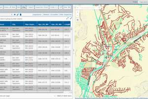
The commission has been spearheading an effort to add more creativity to the paint job on the water towers, which began earlier this year by opening up a design contest to community members. In May, two designs were selected out of the submissions, and Moorhead Public Service asked that they be merged into a single version. The utility is now considering the result for its Oakport water tower, the first of the three towers on the repainting schedule. If all goes well, the towers set to be repainted in 2018 and 2019 could also find themselves serving the dual purpose of water storage and public art.
“The design we came up with could serve well in all areas of Moorhead. I think it’s strong, and it’s something that could stand the test of time,” Stephen Dorsey, one of the artists who collaborated on the final design, told The Forum.
The design incorporates the natural characteristics of the area, such as cattails, a heron, and the Red River, as well as other elements representative of Moorhead like the Hjemkomst Center’s distinctive white tent roofing.
The new design gracing the Oakport water tower come August is now largely dependent on funding. The art commission secured a $9,000 grant, and the utility is budgeting another $15,000. According to The Forum’s report, the design could be modified further to ensure it meets the budget.
“We had to keep in mind the economics of this thing. It’s not an unlimited budget, so we decided to keep it simple and easy for them to paint,” said Jack Lunde, the other designer who worked on the final version.
Many utilities go beyond the monochromatic approach and choose to make their water towers community symbols. Just look at all the submissions each year to Tnemec’s Tank of the Year contest. Where does your utility fall? Do you stick with a simple, clean paint scheme that blends into the surrounding landscape, or do you have a design that draws attention? Comment below or email kyle.rogers@colepublishing.com.
Continue reading for free